Customer Journey Map Template: The Stage Nobody Maps Because Nothing Breaks There
 Written by Martin J.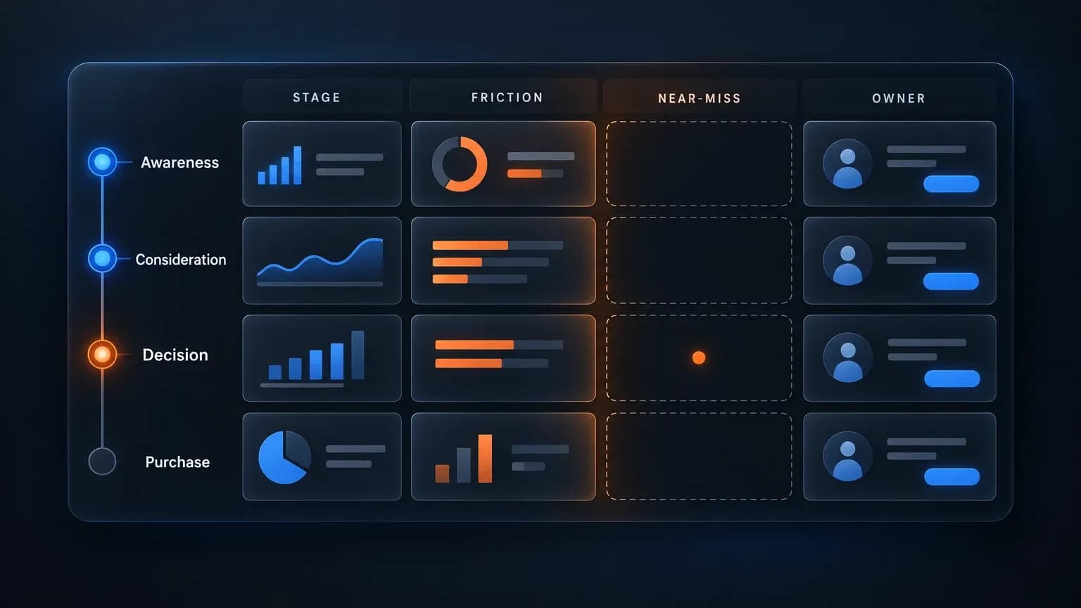
Between us, the document you brought back from the last journey workshop describes a customer who does not quite exist. Every row in it belongs to somebody who stayed. The people who reached the final step and left are absent because the template you were handed asks what your customers did, and never asks what they nearly did. So what would your map look like if the people who almost bought had a column of their own? You already know two of their names. You just never had anywhere to put them.
Your customer journey map template has a column for every stage your customers passed through, and nothing for the ones who reached the last step and left. Between us, that omission is not something anyone decided, because the people who stopped left no record a template can read. So the map you built is shaped entirely by survivors, which is why it keeps telling you that things are basically working. How many of those near-misses could you name right now without opening a report? Two, probably, and neither for a reason anybody wrote down. The templates are not broken either. They were built to describe the journey that happened, and nobody asked them to describe the one that almost did.
The last journey workshop I ran filled in all five stages in ninety minutes, everyone agreed, the sticky notes got photographed, and the document was never opened again. What it never carried was the column for people who reached the last step of a stage and stopped. That is how a map becomes a quiet description of your survivors and then gets read as a description of your customers.
What a Journey Map Is Actually For
A customer journey map template is a diagram of what a person does, thinks, feels and touches between first hearing about you and whatever happens after they buy. The lanes most templates hand you are predictable: stages, actions, touchpoints, and thoughts or questions. Search and you will find that definition already assembled near the top of the page, inside the answer box that sits above the results.
What a map is for is narrower and harder. Forrester's Customer Journey Management Platforms Buyer's Guide (2026), built on 30 buyer interviews, puts the value in one line: a journey earns its keep when it helps a team decide what to build, what to fix and what to stop. That is the same question you are trying to answer in the review.
CX Dive said the same thing more bluntly on 26 May 2026: mapping is one of the most widely used tools in the customer experience toolkit, and most organizations still fail to turn maps into measurable business outcomes. Its name for that outcome is "wall art".
Here is the honest complication. HockeyStack's analysis, published through Userpilot in August 2026, puts the average B2B SaaS deal at 266 touchpoints, rising to 417 once contract value passes $100,000. Five tidy stages summarize that reality rather than describe it.
There is also a practical reason to build this manually rather than wait for a better stack. Adobe's 2026 survey of 3,000 practitioners and executives found that only 39% have a shared customer data platform capable of supporting widespread agentic AI adoption, so buying your way out of the problem is not on the table yet. If you want the wider toolkit for gathering evidence, our roundup of market research tools covers that ground.
The Template
Five columns, one row per stage. The first two columns are what every template in this field already gives you. The fourth is the one nobody ships, and the fifth is what makes the document survive its first review.
Stage | The job being done in it | The friction, in their words | The near-miss, and what it cost | Owner and next action |
|---|---|---|---|---|
Awareness |
|
|
|
|
Consideration |
|
|
|
|
Decision (worked example, illustrative) | "Check whether the annual price still fits what I have left this quarter." | Your customer's actual phrasing, for example: "The total jumped at the last step." | People who reached the step, multiplied by the drop-off rate, multiplied by your close rate on that step, multiplied by order value. The most cited published reason for that stop is unexpected cost, named by 48% of abandoners. | One name, one action, one date. Example: put the full total above the billing step, owned by the growth lead, shipped by the next release. |
Purchase |
|
|
|
|
Post-purchase |
|
|
|
|
The worked row is illustrative, built from published reasons rather than a client's figures. Every other cell comes from your own data, which is the point. Fill the last three columns first and expect fewer rows than you think you need. Three genuinely filled rows beat seven empty ones.
Stage, and the job being done in it
Name the stage, then write the job in the customer's language, one line, no marketing vocabulary. "Check whether the annual price still fits what I have left this quarter" is a job. "Consider purchase" is a label. The difference matters when the row reaches an engineer who has to ship something.
One change worth building in now: the earliest stage increasingly happens inside an AI answer, before anyone visits your site. The first touchpoint in your analytics is often not the first touchpoint at all, and that is a measuring gap rather than an insight you missed.
The friction, named in the customer's words
This is a research instruction, not a summary task. Gather the phrasing rather than paraphrasing it: form field drop-off, support tickets, live chat transcripts, the search terms visitors type after they land, exit survey open fields, sales call notes. When a customer writes "I could not find the delivery date", that sentence goes into the cell unchanged. Marketing language in this column costs you the whole document, because the person fixing the page needs the words the visitor used.

The scale of what you are looking for is well documented. Baymard Institute's 2026 meta-analysis of 50 studies puts average cart abandonment at 70.22%, statistically flat for a decade, with checkout design alone credited with a 35.26% conversion improvement on a typical large site. Forms behave the same way: roughly 67.9% average abandonment, 81% of people who start a form never finish it, multi-step forms losing about 82.4% of starters, and completion as low as 9.7% once a form passes four steps. Unexpected cost at checkout is the single most cited reason, at 48%. You are not hunting edge cases. You are hunting the majority path.
The near-miss, and what it cost
A near-miss is a person who reached the last step of a stage and stopped. Your analytics counts the visit and the session end, and nothing counts the stop. That is why the column stays blank in most documents even when the traffic is sitting right there in the report.

Two things make this lane worth the effort. First, the miss is recoverable. A well-built exit-intent offer converts 3% to 5% of abandoning visitors, strong campaigns pass 8%, and 53% engage with the overlay at all. The same mechanism swings on whether the offer matches the moment: Sleeknote's email-capture popup converts at 1.8%, while OptiMonk measured a cart-abandonment popup at 17.12% in 2025. Klaviyo's benchmark adds the cadence point, with a three-email sequence recovering 18% to 20% of abandoned carts against 3% to 5% for a single email.
Second, the pattern holds beyond ecommerce, which matters if you sell software. Userpilot's benchmark across 62 B2B SaaS companies puts average activation at 37.5%, so roughly two thirds of signups never reach the product's core value. Totango found in 2025 that 60% of trial users who miss core value within 72 hours never come back. Your near-miss lane in a software journey is the signup that never activated, and it is the majority of them.
For the cost, keep the arithmetic honest and small: traffic through the step, times the drop-off rate, times your close rate, times order value. On the illustrative row, 4,000 people reaching a step with a fifth stopping is 800 near-misses a quarter, and at a few hundred dollars an order that is five figures of recoverable revenue.
Owner and next action
Ownership already has a home in this field. Miro's community template ships an accountability block. Zendesk tells teams to show which department owns each stage. The 2026 UX Design Institute guide devotes a step to assigning responsibility. The reason the column stays in this template is assignability: once a near-miss has a cost and a name next to it, the document leaves the workshop and enters a backlog. One owner per row. One action. One date. Give that owner the metric the row is supposed to move, and our breakdown of marketing KPIs is the place to pick one that a team will actually report on.
Where the Usual Templates Stop
Open this search and you mostly get file galleries: Canva, Miro, Figma community, Confluence, all offering the same four lanes and a blank grid. Around them sit a business-school definition piece, a UX research roundup, and threerooms.com's landing page, whose meta description promises a template that makes "lost opportunities visible" and then delivers a signup form. Demandmetric's version ships five phases, a pre-filled chart, 8,529 recorded downloads, and an estimated eight-hour build time.
The four lanes those pages share are not a coincidence. They are the four lanes the answer box at the top of the results recommends: stages, actions, touchpoints, and thoughts or questions. Whatever that summary says becomes the complete definition of the job for a lot of people, which is why the ceiling matters here.
Deckary's February 2026 set is the freshest genuinely worked example material: five filled maps plus a table comparing linear, circular, service blueprint and experience map formats, each with a named limitation. Hustlebadger argues, correctly, that a team learns the method faster from a filled map than from an empty one.
Neither asks what almost happened. Run the same test over the customer journey map example searches and you will hit pages written in 2021, still ranking, still describing a buying journey that predates half of your current channels. If you want to know whether a rival already fixed the step where your visitors stall, our guide to a competitor analysis framework shows how to read their checkout and onboarding for the friction your rows name.
Filling It In Without a Research Budget
You do not need interviews to fill this in. Everything below comes from an artifact you already own, and the whole list fits into one afternoon.
- Step drop-off in analytics. One report showing where each stage loses people, at the step level rather than the page level. 30 minutes.
- Per-field form completion. Most form tools report completion by field. The field with the biggest drop is your first friction cell. 20 minutes.
- Support tickets from the last 90 days. Sweep for "almost", "gave up", "could not find", "too expensive", "kept failing". Copy the sentences verbatim. 45 minutes.
- Live chat and sales call notes. Same sweep, same rule about verbatim quoting. 30 minutes.
- Search terms after landing. Your search console and your ad account both hold the queries people typed while already on your site. 20 minutes.
- An exit survey with three questions and one open field. Ask what they came to do, whether they did it, and what stopped them.
- Cancellation and refund reasons. Usually the fastest path to the friction in the post-purchase row.
- Your memory. The near-misses you named from memory while reading the opening of this article. Write them down before the feeling fades. 5 minutes.
Two lanes of this table can be filled by the end of that afternoon. If the work clearly needs a named person rather than a spare afternoon, our breakdown of the marketing analyst salary tells you what that hire costs.
How This Feeds a Survey or a Feedback Loop
This is where the document starts paying rent: each friction cell is a question you can ask at scale. A row that says visitors stopped on the billing step because the total changed becomes a survey item, and now you have a number to move instead of an anecdote. Customer journey mapping stops being a workshop the moment the map keeps answering questions after everyone goes home. CX Dive names the process: test the hypotheses the map produced, measure the results, keep updating the document. Our guide to running a client satisfaction survey covers the survey side of that loop, including how to keep the questions short enough to get real answers.
Run the loop quarterly, and refresh the near-miss column first. That is the row that decays fastest as you fix things and as your competitors fix theirs.
FAQ
What are the stages of a customer journey?
The conventional set of journey stages has five: awareness, consideration, decision, purchase, and post-purchase or advocacy. It is a useful shorthand and a poor description of reality. Use the stages as section headers, and let the rows carry the detail.
How do I build a customer journey map without interviews?
Pull the phrasing from artifacts you already have. Analytics gives you the step where people stop, form tools give you the field that loses them, support tickets and chat transcripts give you their exact words, and an exit survey gives you the reason at scale. That map is already specific enough to assign actions from.
Is a journey map the same as a funnel?
No, and the difference is the reason both exist. A funnel counts people at each step you control, and it is owned by your team. A journey map describes what the person experiences across every step, including the ones you do not control, and the near-miss lane lives in exactly those gaps. Keep the funnel for reporting volume and the map for deciding what to fix.
Conclusion
The blank column is the cheapest thing in this customer journey map template to fix and the easiest to skip, because nothing in your dashboard flags it. Fill one row this week, with a real cost and a real name next to the near-miss. If the document survives its first review, you will have the thing everybody claims to have and almost nobody does: a map that told you what to build, what to fix, and what to stop.